
Pages

Showing posts with label usability. Show all posts

Sticky Menus Are Quicker To Navigate // navigation usability

Most designers would agree that navigation is one of the most critical components of a website. Despite this, it is not always easy to use or access. Traditionally, users must scroll back to the top of the website to access the navigation menu. I recently wondered whether sticky menus makes websites quicker to navigate, and I conducted a usability study to find the answer. Let’s look at the results of the study, a few implementation techniques and some related challenges.

Sticky Navigation Sign

Sticky, or fixed, navigation is basically a website menu that is locked into place so that it does not disappear when the user scrolls down the page; in other words, it is accessible from anywhere on the website without having to scroll. Although sticky navigation can be applied to any menu, such as the footer or social media buttons, we’ll focus on the main (or primary) navigation of a website. The image below shows the difference between standard and sticky navigation on a mobile device.

Standard Vs Sticky Navigation

For the study, I created two test websites that were nearly identical. The only difference was that one of them had standard navigation and the other had sticky navigation. Forty participants were timed in completing five tasks on the first website. Then they were asked to complete five different tasks on the second website. The order of the tasks was alternated between users to balance out the familiarity factor. The websites were tested on desktop machines, and participants were not told the differences between the websites until the end of their session. Data was not analyzed until the testing was completed. The results of the study yielded two interesting conclusions.

The data from the study indicated that participants were able to find what they were looking for quicker when they didn’t have to scroll back to the top of the page. 22% might not seem like a big number, but it can have a big impact on visitors. According to this data, sticky navigation could cut 36 seconds off of a five-minute visit to a website. Of course, keeping visitors on the page longer is only a benefit if you are enhancing the user experience along with it. Forcing people to dig through a website to find something does not qualify as such.

At the end of each session, users were asked whether they noticed the difference between the two user interfaces. No one was able to identify it. The changes were subtle, and none of the users caught on because they were focused on completing their tasks. Participants were then asked whether one of the websites felt easier to use. Six of the 40 participants had no preference, but of the 34 that did have a preference, 100% of them indicated that the website with the sticky navigation was easier or faster to use. Many comments along this line were made, such as “I don’t know how the websites were different, but I felt like I was spending a lot less time clicking with the first one.” Such comments indicated overwhelming favor for the sticky navigation.

Imagine typing a document in Microsoft Word and having to scroll up to the top of the first page every time you wanted to bold a word or widen the margins. Just the thought of that sounds frustrating. Most desktop software provides access to the entire navigation menu no matter what you are doing in the application. The Web browser is no different; we would find it ridiculous to have to scroll to the top of a website to access the address bar of a browser.

Facebook and Google+ recently adopted sticky navigation, but they are among the minority. Of the 25 most visited websites in the US, only 16% currently have sticky navigation. Below are some examples of other websites that do an excellent job of pulling this off.

Fizzy Software
This is a perfect example of horizontal sticky navigation at the very top. Everything feels comfortable while you’re using the website.

Fizzy Software Navigation

Web Appers
The navigation here is vertical and on the left, somewhat resembling Google+’s navigation. The only downside here is that if the screen’s height is shorter than 560 pixels, then the bottom portion of the menu could become inaccessible, which was the case when I tested the website on a netbook.

Web Appers Navigation

MakeBetterApps
Here is another great example. Making the navigation slightly transparent, giving a hint of the content beneath it, is a nice touch.

Make Better Apps Navigation

Rodolphe Celestin
This sticky navigation spreads all the way across the top, but when you scroll down the page, the design of the menu changes slightly. Simplifying the design like this can be a good technique, as long as it doesn’t feel inconsistent. Also, the designer has taken an increasingly popular approach by making the entire website just one page; the menu links are anchors that bump you down the page. Some nice transitions and hover effects make this website enjoyable to use.

Rodolphe Celestin Navigation

Ryan Scherf
The navigation on this website is vertical and only icons. The creativity here is impressive.

Ryan Scherf Navigation

Web Designer Wall
The sticky vertical navigation works well on this website because the menu has only four items. This works well enough for blogs that I wonder why others don’t adopt this approach.

Web Designer Wall Navigation

While sticky menus aren’t the most popular form of navigation, more and more examples are popping up all the time.

This might seem like a straightforward way to implement sticky navigation, but avoid this method. iFrames cause more problems than they solve, particularly with cross-browser compatibility, security and search engine optimization. iFrames have their place, but they shouldn’t be a major part of your HTML layout.

CSS is a great way to implement sticky navigation. It also seems to be the most straightforward, most lightweight and quickest to code. The three things to pay attention to are position, margin-top and z-index. Setting the menu’s position to fixed disables the element from scrolling with the rest of the page. This will likely throw off your margins if your navigation is horizontal, so you’ll want to adjust for that. Finally, use z-index with a horizontal menu to make sure the navigation sits on top of everything; this will make the other content slide underneath the navigation as you scroll. Here is the general idea:

#navigation { position: fixed; z-index: 10;}#header { margin-top: 50px;}

You will have to play around with the CSS to make this technique work right for your website. Additional information can be found on the W3C’s website.

Smart Sticky Bar Navigation
The Simple Smart Sticky Navigation Bar is one of many good JavaScript implementations.

If you would prefer a jQuery or JavaScript solution to a CSS one, then you could try out one of the following options:

Many other solutions and scripts are out there. Please include your favorites in the comments below.

Give Me The Bad News

There are many opinions on this topic, and some would argue that sticky navigation isn’t worth it. Here are some things to be aware of.

Going with sticky navigation could rule out some design choices that your team might not be willing to give up. For example, the most logical place for horizontal sticky navigation would be at the very top of the page, above everything else. While easy to implement, it might not be what your users need.

If not done carefully, sticky navigation can be distracting. Some sticky elements get delayed when bouncing back into position as the user scrolls down the page. Others are so tall or wide that they dominate the layout and impede access to the content. Navigation should be easily accessible but should not compete with the content for attention.

Fixed-position CSS and certain JavaScript implementations lack support in some mobile browsers, which is a cause for concern among some developers. The article “Organizing Mobile” by Luke Wroblewski has some great principles to keep in mind when creating navigation for mobile devices. Responsive design techniques also offer some solutions for adjusting the navigation based on the size of the screen.

Be aware of the level of support offered by each device. Knowing compatibility issues beforehand will save you time in the end. When Can I Use? has some interesting information on support for position: fixed. Brad Frost has also done some of his own testing and analysis, providing some interesting insight in his accompanying video.

Why do we Web designers and developers continually force our users to scroll up and down the page in search of the navigation? This is not a problem in desktop software, and we now have the statistics to show the benefits of sticky menus. Navigation on 84% of the top 25 most visited US websites could be made quicker by implementing sticky navigation.

Of course, it’s not appropriate in every situation, especially when real estate is tight. But do seriously consider sticky navigation, while always accounting for usability and the overall user experience.

(al)

Hyrum has a BA in Computer Science and has been in the web design and development industry for a number of years. He is currently a UX/UI Designer at SirsiDynix. He previously operated his own ux studio as well as worked as the Director of Web Operations in the eCommerce industry. Hyrum has a passion for learning new things and is particularly interested in anything to do with user experience design and the psychology behind how people use websites.

Yay! You've decided to leave a comment. That's fantastic! Please keep in mind that comments are moderated and rel="nofollow" is in use. So, please do not use a spammy keyword or a domain as your name, or it will be deleted. Let's have a personal and meaningful conversation instead. Thanks for dropping by!

Read more >>

The History Of Usability: From Simplicity To Complexity

The story of usability is a perverse journey from simplicity to complexity. That’s right, from simplicity to complexity—not the other way around.

If you expect a “user-friendly” introduction to usability and that the history of usability is full of well-defined concepts and lean methods, you’re in for a surprise. Usability is a messy, ill-defined, and downright confusing concept. The more you think about it—or practice it—the more confusing it becomes. We learned that the history of usability is a “perverse journey from simplicity to complexity”.

If we go far back in history, Vitruvius (1st century BC) was probably the first person to lay forth systematic and elaborated principles of design. His three core design principles became very influential:

Firmitas: The strength and durability of the design;Utilitas: A design’s usefulness and suitability for the needs of its intended users;Venustas: The beauty of the design.

Vitruvius’ work was an inspiration to people like Leonardo da Vinci, who drew the well-known Vitruvian Man (fig. 1 below). By empirically measuring and calculating the proportions of the human body, and emphasising the “utilitas” principle, Vitruvius may be considered the first student of ergonomics and usability.


Figure 1: The Vitruvian Man drawing was created by Leonardo da Vinci circa 1487 based on the work of Vitruvius.

The discipline of usability is also rooted in the discipline called Human Factors, which started as military personnel asked themselves the very morbid question:

“What design do we need to kill more enemies through better matching soldier and weapon? And thus avoid getting killed ourselves.”

Both World War I and World War II fueled research into Human Factors. When designing artillery cannons, for example, usability yielded more precision, greater kills, and shorter training of personnel.

Thus, military designers could extract some very concrete usability metrics. For example:

How quickly will a new crew member learn how to use the artillery cannon (now that the former crew member is dead)?How many rounds per minute (ordnance) is the cannon able to fire with an inexperienced versus an experienced crew?How will improving the design of the cannon improve target acquisition (and thus kill more enemies)?How does a design improvement decrease soldier fatigue (as a consequence of a lighter cognitive load)?

Cyclone
Figure 2: Photograph of the French 320 mm railway gun Cyclone, taken in Belgium in 1917. The gun required not only trained personnel to fire it, but also trained personnel to drive it.

Howitzer
Figure 3: A 155 mm artillery shell fired by a United States 11th Marine Regiment’s M-198 howitzer. The setup time (and thus usability) is essential as anti-artillery weapons necessitate that the position of the howitzer be changed very quickly after firing.

The concept of usability has its more recent and direct origins in the falling prices of computers in the 1980s, when for the first time it was feasible for many employees to have their own personal computer. In the 80s, most computer users had practically no, or only basic, training on operating systems and applications software. However, software design practices continued to implicitly assume knowledgeable and competent users, who would be familiar with technical vocabularies and system architectures, and also possess an aptitude for solving problems arising from computer usage.

Such implicit assumptions rapidly became unacceptable. For the average user, interactive computing became associated with constant frustrations and consequent anxieties. Computers were obviously too hard to use for most users, and often absolutely inpractical. Usability thus became a key goal for the design of any interactive software that would not be used by trained technical computer specialists.

The current understanding of usability is different from the early days in the 1980s. Usability used to be a dominant concept but this changed with research increasingly focused on usage contexts. Usage quality no longer appeared to be a simple issue of how inherently usable an interactive system was, but how well it fitted its context of use.

Usability is a contested historical term that is difficult to replace. User experience specialists have to refer to usability, since it is a strongly established concept within the IT landscape. In simplified terms, usability work is about finding out what’s good and what’s bad. However, when we examine the hundreds of usability evaluation methods in use, we do see that different approaches to usability result in differences over the causes of good and poor usability. That may sound complicated but let’s take two different approaches to usability:

If you think usability is a feature of an interactive system, your approach to usability may be called essentialist—i.e. poor/good usability resides in the “essense” of the system. You will typically find yourself saying things like “that website is not user-friendly”, “a website or system has poor usability when there is no visibility of system status”, “I can reliably measure which website has the best usability”, etc. This means you think that all causes of user performance are due to technology. In that case, you will typically use system-centered usability inspection methods to identify such causes.On the other hand, if you think usability is a feature of the interaction between user, computer and the context, your approach to usability is contextual—i.e. depending on the context. This means that you think questions of user performance have different causalities, some due to technologies, and others due to some aspect(s) of usage contexts, but most due to interactions between both. Several evaluation and other methods may be needed to identify and relate a nexus of causes. You will often find yourself saying vague things like “that depends…”, “well… this website checkout procedure is great for male, fact-oriented, middle-aged buyers, but not for an impatient teenager doing the purchase on his smartphone sitting in the bus”, etc.

The reason I mention the essentialist/contextual distinction is that anyone involved with usability should—ideally—be able to say “this website/technology/system is good, that one is bad”. After all, isn’t that what your client or boss is paying you to do?

To answer if the usability of a website is good or bad you have to employ a usability method. And your choice of usability method will depend on your approach to usability—whether you admit it or not. Maybe you’ll deny it and say, “I’ve never heard of any essentialist/contextual approaches to usability.” However, that would be like selling French wine without ever having spent time in a French vineyard. You can do it, but at some point your client or boss will start asking questions you can’t answer. Or your decisions will have unexpected side-effects.

So what usability method should you choose to determine “what’s good and what’s bad”?

Usability work can involve a mix of methods and the mix can be guided by high level distinctions between methods, for example the distinction between analytical and empirical evaluation methods.

Analytical evaluation methods are based on examination of an interactive system and/or potential interactions with it. You analyse the system or analyse the interaction with the system.Empirical evaluation methods, on the other hand, are based on actual usage data.

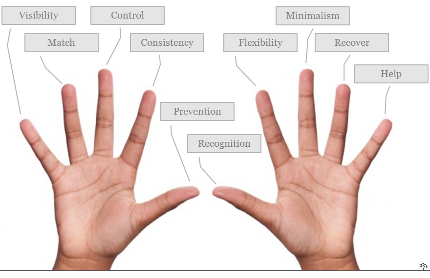
Analytical evaluation methods may be system-centred, like Jakob Nielsen’s Heuristic Evaluation or interaction-centred, like the Cognitive Walkthrough method. Design teams use the resources provided by a method (e.g. heuristics) to identify strong and weak elements of a design from a usability perspective.

Three types of analytical evaluation methods:

Inspection methods tend to focus on the causes of good or poor usability.System-centered inspection methods focus solely on software and hardware features regarding attributes that will promote or obstruct usability.Interaction-centered methods focus on two or more causal factors (i.e. software features, user characteristics, task demands, or other contextual factors).


Figure 4: Jakob Nielsen’s Heuristic Evaluation is a good example of an analytical evaluation method. Heuristic Evaluation became the most popular user-centered design approach in the 1990s, but has become less prominent with the move away from desktop applications.

Empirical evaluation methods focus on evidence of good or poor usability, i.e. the positive or negative effects of attributes of software, hardware, user capabilities and usage environments. User testing is the principal project-focused method. It uses project-specific resources such as test tasks, users, and also measuring instruments to expose usability problems that can arise in use. Also, empirical experiments can be used to demonstrate superior usability arising from user interface components (e.g. text entry on mobile phones) or to optimise tuning parameters (e.g. timings of animations for windows opening and closing).

Such experiments assume that the test tasks, users and contexts allow generalisation in regards to other users, tasks and contexts. Such assumptions are readily broken, e.g. when users are very young or elderly, or have impaired movement or perception.

Achieving a balanced mix of evaluation methods is not straightforward, and involves more than simply combining analytical and empirical methods. This is because there is more to usability work than simply choosing and using methods.

Evaluation methods are as complete as a Chicken Fajita Kit, which contains very little of what is actually needed to make Chicken Fajitas: no chicken, no onion, no peppers, no cooking oil, etc. Similarly, user testing ‘methods’ miss out equally vital ingredients and project-specific resources such as participant recruitment criteria, screening questionnaires, consent forms, test task selection criteria, test (de)briefing scripts, target thresholds, data analysis methods, or reporting formats.

There is no complete published user testing method that novices can pick up and use ‘as is’. All user testing requires extensive project-specific planning and implementation. Much usability work is about configuring and combining methods for project-specific use.


Figure 5. Chicken Fajita Kit. Copyright Old El Paso. All rights reserved.

When planning usability work, it is important to recognise that so-called ‘methods’ are simply loose collections of resources better understood as ‘approaches’. There is much work in getting usability work to work, and as with all knowledge-based work, methods cannot be copied from books and applied without a strong understanding of fundamental underlying concepts. All methods must have unique usage settings that require project-specific resources. For user testing, for example, these include participant recruitment, test procedures and (de-)briefings. There are no universal measures of usability that are relevant to every software development project.

There are fundamental differences on the nature of usability, i.e. it is either an inherent property of interactive systems, or an emergent property of usage. There is no single definitive answer to what usability ‘is’.There are no universal measures of usability and no fixed thresholds above or below which all interactive systems are or are not usable. There are no universal, robust, objective and reliable metrics. All positions here involve hard won expertise, judgement calls, and project-specific resources beyond what all documented evaluation methods provide.Usability work is too complex and project-specific to admit generalised methods. What are called ‘methods’ are more realistically ‘approaches’ that provide loose sets of resources that need to be adapted and configured on a project by project basis.

Readers could reasonably draw the conclusion from the above that usability is an attractive idea in principle that has limited real-world application. However, the reality is that we all continue to experience frustrations when using interactive digital technologies, and even we would say that we find them difficult to use. Even so, frustrating user experiences may not be due to some single abstract construct called ‘usability’, but instead be the result of unique complex interactions between people, technology and usage contexts.

In well directed design teams, there will not be enough work for a pure usability specialist. This is evidenced by a trend within the last decade of a broadening from usability to user experience expertise. User experience work focuses on both positive and negative value, both during usage and after it. A sole focus on negative aspects of interactive experiences is becoming rarer. Useful measures of usage are extending beyond the mostly cognitive problem measures of 1980s usability to include positive and negative effect, attitudes and values, e.g. fun, trust, and self-affirmation. The coupling between evaluation and design is being improved by user experience specialists with design competences.

Many user experience professionals have also developed specific competences in areas such as brand experience, trust markers, search experience/optimisation, usable security and privacy, game experience, self and identity, and human values. We can see two trends here. The first involves complementing human-centered expertise with strong understandings of specific technologies such as search and security. The second involves a broadening of human-centered expertise to include business competences (e.g. branding) and humanistic psychological approaches (e.g. phenomenology, meaning and value).

As such, a usability person is not a lone judge who makes the call “is this usable?” Instead, the usability proficient person will often be a team player taking on many roles in the product development lifecycle.

Rower

Row Team
Figure 6 A-B. From Solo Specialist to Team Member: User Experience—as opposed to Usability—as an integrated part of design teams. Copyright of leftmost picture: Flickr user ‘Tety’ through the Creative Commons Attribution Share-Alike 2.0 licence

This Smashing Magazine article is a digested version of the monstrous 25,000 word encyclopedic introduction to the history of Usability Evaluation at Interaction-Design.org. It’s available in a special version for Smashing readers.

Did this article confuse you more than it informed you? Well, it should! If you want an answer to the question of “what is usability?”, it’s just as complicated as asking “what is beauty?” The more you think about it, the less you feel you know. I don’t believe you will ever find the answer to the question “what is usability?”, but I nevertheless hope you—as I—will continue to ask that very question. And be confused again and again. Confusion is—after all—the mother of wisdom.

The concept of usability is a product of millions of designers trying for decades to describe what they are doing to make technology easier and more pleasant. As such, the concept is immensely complex. It may have started out as a simple concept but the more people who are involved with usability, the more multi-faceted the concept will become. Therefore, the history of usability is a journey from simplicity to complexity. Is that journey worth the effort? Certainly! Anyone who masters usability—and all its facets—has a power position when it comes to designing easy/pleasant/cool/useful/usable/etc. technology. As confusing as that endeavour may be!

(jc) (il)

Mads is editor-in-chief at Interaction-Design.org and considers himself a bit of a Smashing Magazine wannabe. He has worked at The Danish National Technological Institute with research in industry. Until 2000 he was one of three partners in Csite.com, a web development company. He worked in the eBusiness Think Tank of Daimler and also as a lecturer at the Department of Information and Media Studies at the University of Aarhus. He was a PHD student at the Department of Computer Science at the University of Aarhus and at University of California at Irvine. He also spent six months at University of Tasmania's School of Psychology. He lived a year in Manitoba, Canada where he learned to say "eh" like a true Canadian.

Yay! You've decided to leave a comment. That's fantastic! Please keep in mind that comments are moderated and rel="nofollow" is in use. So, please do not use a spammy keyword or a domain as your name, or it will be deleted. Let's have a personal and meaningful conversation instead. Thanks for dropping by!
Read more >>

The History Of Usability: From Simplicity To Complexity

The story of usability is a perverse journey from simplicity to complexity. That’s right, from simplicity to complexity—not the other way around.

If you expect a “user-friendly” introduction to usability and that the history of usability is full of well-defined concepts and lean methods, you’re in for a surprise. Usability is a messy, ill-defined, and downright confusing concept. The more you think about it—or practice it—the more confusing it becomes. We learned that the history of usability is a “perverse journey from simplicity to complexity”.

If we go far back in history, Vitruvius (1st century BC) was probably the first person to lay forth systematic and elaborated principles of design. His three core design principles became very influential:

Firmitas: The strength and durability of the design;Utilitas: A design’s usefulness and suitability for the needs of its intended users;Venustas: The beauty of the design.

Vitruvius’ work was an inspiration to people like Leonardo da Vinci, who drew the well-known Vitruvian Man (fig. 1 below). By empirically measuring and calculating the proportions of the human body, and emphasising the “utilitas” principle, Vitruvius may be considered the first student of ergonomics and usability.


Figure 1: The Vitruvian Man drawing was created by Leonardo da Vinci circa 1487 based on the work of Vitruvius.

The discipline of usability is also rooted in the discipline called Human Factors, which started as military personnel asked themselves the very morbid question:

“What design do we need to kill more enemies through better matching soldier and weapon? And thus avoid getting killed ourselves.”

Both World War I and World War II fueled research into Human Factors. When designing artillery cannons, for example, usability yielded more precision, greater kills, and shorter training of personnel.

Thus, military designers could extract some very concrete usability metrics. For example:

How quickly will a new crew member learn how to use the artillery cannon (now that the former crew member is dead)?How many rounds per minute (ordnance) is the cannon able to fire with an inexperienced versus an experienced crew?How will improving the design of the cannon improve target acquisition (and thus kill more enemies)?How does a design improvement decrease soldier fatigue (as a consequence of a lighter cognitive load)?

Cyclone
Figure 2: Photograph of the French 320 mm railway gun Cyclone, taken in Belgium in 1917. The gun required not only trained personnel to fire it, but also trained personnel to drive it.

Howitzer
Figure 3: A 155 mm artillery shell fired by a United States 11th Marine Regiment’s M-198 howitzer. The setup time (and thus usability) is essential as anti-artillery weapons necessitate that the position of the howitzer be changed very quickly after firing.

The concept of usability has its more recent and direct origins in the falling prices of computers in the 1980s, when for the first time it was feasible for many employees to have their own personal computer. In the 80s, most computer users had practically no, or only basic, training on operating systems and applications software. However, software design practices continued to implicitly assume knowledgeable and competent users, who would be familiar with technical vocabularies and system architectures, and also possess an aptitude for solving problems arising from computer usage.

Such implicit assumptions rapidly became unacceptable. For the average user, interactive computing became associated with constant frustrations and consequent anxieties. Computers were obviously too hard to use for most users, and often absolutely inpractical. Usability thus became a key goal for the design of any interactive software that would not be used by trained technical computer specialists.

The current understanding of usability is different from the early days in the 1980s. Usability used to be a dominant concept but this changed with research increasingly focused on usage contexts. Usage quality no longer appeared to be a simple issue of how inherently usable an interactive system was, but how well it fitted its context of use.

Usability is a contested historical term that is difficult to replace. User experience specialists have to refer to usability, since it is a strongly established concept within the IT landscape. In simplified terms, usability work is about finding out what’s good and what’s bad. However, when we examine the hundreds of usability evaluation methods in use, we do see that different approaches to usability result in differences over the causes of good and poor usability. That may sound complicated but let’s take two different approaches to usability:

If you think usability is a feature of an interactive system, your approach to usability may be called essentialist—i.e. poor/good usability resides in the “essense” of the system. You will typically find yourself saying things like “that website is not user-friendly”, “a website or system has poor usability when there is no visibility of system status”, “I can reliably measure which website has the best usability”, etc. This means you think that all causes of user performance are due to technology. In that case, you will typically use system-centered usability inspection methods to identify such causes.On the other hand, if you think usability is a feature of the interaction between user, computer and the context, your approach to usability is contextual—i.e. depending on the context. This means that you think questions of user performance have different causalities, some due to technologies, and others due to some aspect(s) of usage contexts, but most due to interactions between both. Several evaluation and other methods may be needed to identify and relate a nexus of causes. You will often find yourself saying vague things like “that depends…”, “well… this website checkout procedure is great for male, fact-oriented, middle-aged buyers, but not for an impatient teenager doing the purchase on his smartphone sitting in the bus”, etc.

The reason I mention the essentialist/contextual distinction is that anyone involved with usability should—ideally—be able to say “this website/technology/system is good, that one is bad”. After all, isn’t that what your client or boss is paying you to do?

To answer if the usability of a website is good or bad you have to employ a usability method. And your choice of usability method will depend on your approach to usability—whether you admit it or not. Maybe you’ll deny it and say, “I’ve never heard of any essentialist/contextual approaches to usability.” However, that would be like selling French wine without ever having spent time in a French vineyard. You can do it, but at some point your client or boss will start asking questions you can’t answer. Or your decisions will have unexpected side-effects.

So what usability method should you choose to determine “what’s good and what’s bad”?

Usability work can involve a mix of methods and the mix can be guided by high level distinctions between methods, for example the distinction between analytical and empirical evaluation methods.

Analytical evaluation methods are based on examination of an interactive system and/or potential interactions with it. You analyse the system or analyse the interaction with the system.Empirical evaluation methods, on the other hand, are based on actual usage data.

Analytical evaluation methods may be system-centred, like Jakob Nielsen’s Heuristic Evaluation or interaction-centred, like the Cognitive Walkthrough method. Design teams use the resources provided by a method (e.g. heuristics) to identify strong and weak elements of a design from a usability perspective.

Three types of analytical evaluation methods:

Inspection methods tend to focus on the causes of good or poor usability.System-centered inspection methods focus solely on software and hardware features regarding attributes that will promote or obstruct usability.Interaction-centered methods focus on two or more causal factors (i.e. software features, user characteristics, task demands, or other contextual factors).


Figure 4: Jakob Nielsen’s Heuristic Evaluation is a good example of an analytical evaluation method. Heuristic Evaluation became the most popular user-centered design approach in the 1990s, but has become less prominent with the move away from desktop applications.

Empirical evaluation methods focus on evidence of good or poor usability, i.e. the positive or negative effects of attributes of software, hardware, user capabilities and usage environments. User testing is the principal project-focused method. It uses project-specific resources such as test tasks, users, and also measuring instruments to expose usability problems that can arise in use. Also, empirical experiments can be used to demonstrate superior usability arising from user interface components (e.g. text entry on mobile phones) or to optimise tuning parameters (e.g. timings of animations for windows opening and closing).

Such experiments assume that the test tasks, users and contexts allow generalisation in regards to other users, tasks and contexts. Such assumptions are readily broken, e.g. when users are very young or elderly, or have impaired movement or perception.

Achieving a balanced mix of evaluation methods is not straightforward, and involves more than simply combining analytical and empirical methods. This is because there is more to usability work than simply choosing and using methods.

Evaluation methods are as complete as a Chicken Fajita Kit, which contains very little of what is actually needed to make Chicken Fajitas: no chicken, no onion, no peppers, no cooking oil, etc. Similarly, user testing ‘methods’ miss out equally vital ingredients and project-specific resources such as participant recruitment criteria, screening questionnaires, consent forms, test task selection criteria, test (de)briefing scripts, target thresholds, data analysis methods, or reporting formats.

There is no complete published user testing method that novices can pick up and use ‘as is’. All user testing requires extensive project-specific planning and implementation. Much usability work is about configuring and combining methods for project-specific use.


Figure 5. Chicken Fajita Kit. Copyright Old El Paso. All rights reserved.

When planning usability work, it is important to recognise that so-called ‘methods’ are simply loose collections of resources better understood as ‘approaches’. There is much work in getting usability work to work, and as with all knowledge-based work, methods cannot be copied from books and applied without a strong understanding of fundamental underlying concepts. All methods must have unique usage settings that require project-specific resources. For user testing, for example, these include participant recruitment, test procedures and (de-)briefings. There are no universal measures of usability that are relevant to every software development project.

There are fundamental differences on the nature of usability, i.e. it is either an inherent property of interactive systems, or an emergent property of usage. There is no single definitive answer to what usability ‘is’.There are no universal measures of usability and no fixed thresholds above or below which all interactive systems are or are not usable. There are no universal, robust, objective and reliable metrics. All positions here involve hard won expertise, judgement calls, and project-specific resources beyond what all documented evaluation methods provide.Usability work is too complex and project-specific to admit generalised methods. What are called ‘methods’ are more realistically ‘approaches’ that provide loose sets of resources that need to be adapted and configured on a project by project basis.

Readers could reasonably draw the conclusion from the above that usability is an attractive idea in principle that has limited real-world application. However, the reality is that we all continue to experience frustrations when using interactive digital technologies, and even we would say that we find them difficult to use. Even so, frustrating user experiences may not be due to some single abstract construct called ‘usability’, but instead be the result of unique complex interactions between people, technology and usage contexts.

In well directed design teams, there will not be enough work for a pure usability specialist. This is evidenced by a trend within the last decade of a broadening from usability to user experience expertise. User experience work focuses on both positive and negative value, both during usage and after it. A sole focus on negative aspects of interactive experiences is becoming rarer. Useful measures of usage are extending beyond the mostly cognitive problem measures of 1980s usability to include positive and negative effect, attitudes and values, e.g. fun, trust, and self-affirmation. The coupling between evaluation and design is being improved by user experience specialists with design competences.

Many user experience professionals have also developed specific competences in areas such as brand experience, trust markers, search experience/optimisation, usable security and privacy, game experience, self and identity, and human values. We can see two trends here. The first involves complementing human-centered expertise with strong understandings of specific technologies such as search and security. The second involves a broadening of human-centered expertise to include business competences (e.g. branding) and humanistic psychological approaches (e.g. phenomenology, meaning and value).

As such, a usability person is not a lone judge who makes the call “is this usable?” Instead, the usability proficient person will often be a team player taking on many roles in the product development lifecycle.

Rower

Row Team
Figure 6 A-B. From Solo Specialist to Team Member: User Experience—as opposed to Usability—as an integrated part of design teams. Copyright of leftmost picture: Flickr user ‘Tety’ through the Creative Commons Attribution Share-Alike 2.0 licence

This Smashing Magazine article is a digested version of the monstrous 25,000 word encyclopedic introduction to the history of Usability Evaluation at Interaction-Design.org. It’s available in a special version for Smashing readers.

Did this article confuse you more than it informed you? Well, it should! If you want an answer to the question of “what is usability?”, it’s just as complicated as asking “what is beauty?” The more you think about it, the less you feel you know. I don’t believe you will ever find the answer to the question “what is usability?”, but I nevertheless hope you—as I—will continue to ask that very question. And be confused again and again. Confusion is—after all—the mother of wisdom.

The concept of usability is a product of millions of designers trying for decades to describe what they are doing to make technology easier and more pleasant. As such, the concept is immensely complex. It may have started out as a simple concept but the more people who are involved with usability, the more multi-faceted the concept will become. Therefore, the history of usability is a journey from simplicity to complexity. Is that journey worth the effort? Certainly! Anyone who masters usability—and all its facets—has a power position when it comes to designing easy/pleasant/cool/useful/usable/etc. technology. As confusing as that endeavour may be!

(jc) (il)

Mads is editor-in-chief at Interaction-Design.org and considers himself a bit of a Smashing Magazine wannabe. He has worked at The Danish National Technological Institute with research in industry. Until 2000 he was one of three partners in Csite.com, a web development company. He worked in the eBusiness Think Tank of Daimler and also as a lecturer at the Department of Information and Media Studies at the University of Aarhus. He was a PHD student at the Department of Computer Science at the University of Aarhus and at University of California at Irvine. He also spent six months at University of Tasmania's School of Psychology. He lived a year in Manitoba, Canada where he learned to say "eh" like a true Canadian.

Yay! You've decided to leave a comment. That's fantastic! Please keep in mind that comments are moderated and rel="nofollow" is in use. So, please do not use a spammy keyword or a domain as your name, or it will be deleted. Let's have a personal and meaningful conversation instead. Thanks for dropping by!

Read more >>

Week in iPad: Newsstand woes, 7-inch usability, Google Currents and carousels

Week in iPad for October November 20, 2011

Missed a compelling piece of iPad news, a great app review, or a killer how-to? We’re not collecting absolutely everything in iPad here — you can hit up TiPb.com/iPad for that! — but we’re carefully picking what we think is the best of the last 7 days and presenting it here. For you.

And hey! — these double as show notes for our iPad Live! podcast tonight at 9pm Eastern. So join us and follow along!

Read more >>
Next Post